When selecting the ideal color scheme for your Airbnb, envision the ambiance you wish to convey to your guests as soon as they step through the door. The colors you choose can influence their emotions and overall experience during their stay. Consider how different hues can impact the perception of space and comfort within your rental. By strategically selecting a palette that aligns with your property's style and purpose, you can elevate the guest experience and create a memorable environment that leaves a lasting impression.
Understanding Color Psychology
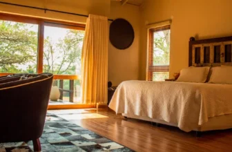
When selecting a color palette for your Airbnb, understanding color psychology plays a crucial role in creating the desired atmosphere. Colors have the power to evoke emotions and set the tone for your space. For a cozy and welcoming feel in your rental, consider warm tones like earthy browns, soft oranges, or deep reds. These colors can make guests feel comfortable and at home.
On the other hand, if you aim to create a sense of tranquility and relaxation, cool tones such as blues, greens, and purples can be ideal. These colors are known for their calming effects and can help guests unwind after a long day of travel or exploration. Additionally, incorporating neutral colors like beige, grey, or white can provide a versatile base for your color palette, allowing you to easily add pops of other hues through decor items like pillows, rugs, or artwork.
Assessing Your Airbnb's Layout
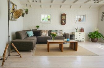
Assess the layout of your Airbnb to optimize space utilization and enhance guest experience. Start by considering the flow of your space. Ensure that there are no obstructions that hinder movement and that guests can easily navigate through the rooms. Take note of areas where guests might spend the most time, such as the living room or kitchen, and arrange furniture to create inviting and functional spaces.
Evaluate the functionality of each room. Bedrooms should offer privacy and comfort, while common areas should be welcoming for social interaction. Consider the placement of amenities like TVs or work desks to cater to different guest needs. Lighting is crucial in setting the right ambiance. Make use of natural light where possible and supplement with warm artificial lighting to create a cozy atmosphere.
Additionally, assess the storage options available. Provide adequate space for guests to store their belongings neatly, whether it's through closets, drawers, or shelves. A well-organized space not only enhances the guest experience but also contributes to a positive review and increased bookings.
Finding Inspiration From Nature
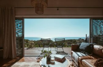
To infuse your Airbnb with a refreshing and calming ambiance, draw inspiration from the soothing colors and textures found in nature. Consider the serene blues of the ocean, the earthy tones of a forest, or the warm hues of a sunset. These natural colors can evoke feelings of tranquility and relaxation in your space. Think about incorporating shades of green for a sense of rejuvenation, or soft browns and beiges for a grounding effect.
Textures found in nature can also guide your color choices. Reflect on the smoothness of polished stones, the roughness of tree bark, or the softness of flower petals. These textures can inspire you to select complementary colors that enhance the overall atmosphere of your Airbnb.
Harmonizing Colors for Cohesive Design
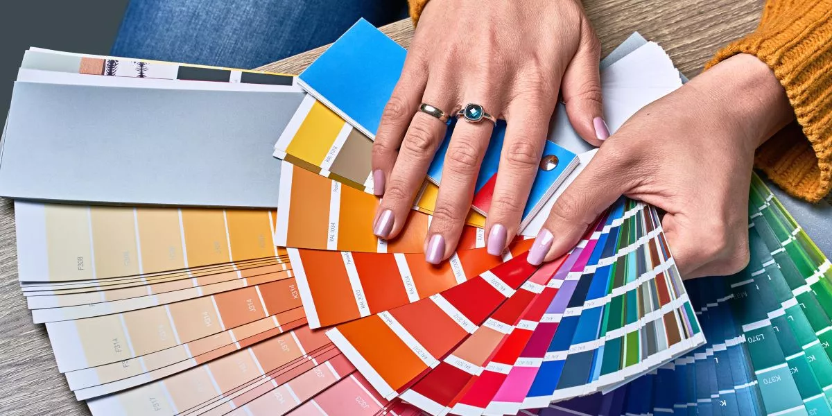
Consider blending different hues and tones to create a harmonious color palette that ties your Airbnb's design elements together seamlessly. Start by selecting a base color that will serve as the foundation for your palette. This could be a neutral shade like beige or gray, which can provide a calm and balanced backdrop for the rest of your chosen colors.
Once you have your base color, introduce complementary shades that enhance the overall aesthetic. For example, if your base color is a soft gray, consider adding accents of dusty blue or blush pink to add depth and interest to the space. These complementary colors can be incorporated through decorative pillows, throws, artwork, or small accent furniture pieces.
To ensure cohesion, limit your palette to 3-5 colors that work well together. Too many colors can create visual clutter and disrupt the flow of your design. By harmonizing your color choices, you can achieve a cohesive look that's visually appealing and inviting to your Airbnb guests.